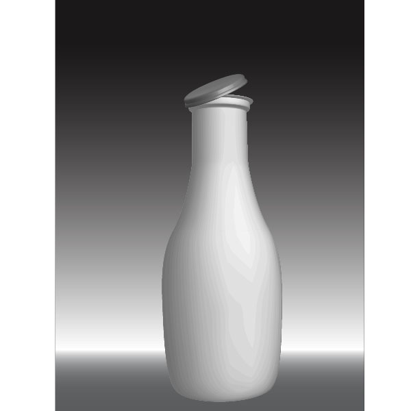
Create a Milk Bottle with a Funny Cow Label
Final Image Preview
Below is the final image we will be working towards. Want access to the full Vector Source files and downloadable copies of every tutorial, including this one? JoinVector Plus for just 9$ a month.

Step 1
Open up a new document and draw a rectangle with the Rectangle tool (M). Fill it with a gray to white to black linear gradient and set the gradient highlight towards the bottom.

Step 2
Select the Pen tool (P) and start drawing half of a bottle. We need only the outline. Make sure the fill is set to none and the
stroke to white with 1pt. You can use a reference image if you have trouble with drawing a bottle.
stroke to white with 1pt. You can use a reference image if you have trouble with drawing a bottle.

Step 3
Draw another small shape that is half of an outline of a bottle cap. Make sure that both paths are separate.

Step 4
Select the bottle path with the Selection tool (V) and go to Effect > 3D > Revolve. Apply the following options: -5, -26,
and 3. Also, set 45 degrees for the Perspective. Click OK and voila, the milk bottle.
and 3. Also, set 45 degrees for the Perspective. Click OK and voila, the milk bottle.

Step 5
Repeat Step 4 with the cap path. Change the stroke color to a light grey and apply the settings shown below.

Step 6
This is what the bottle should look like at the moment. Not bad for a small few steps.
Step 7
On to the label. We want to create a funky looking cow. So let's start with the outline. Start drawing an outline of a
cow from the back. We need two legs and some hips on a big back.
cow from the back. We need two legs and some hips on a big back.

Step 8
Create a polygon shape and fill it with black. This will be the black color spots for the cow.

Step 9
Select the shape,then go to Effect > Distort & Transform > Roughen and apply the settings shown below.

Step 10
Repeat Step 9 and add many more black spots. Make sure that some overlap the cow outline. Select all the black spots and expand their appearance (Object > Expand).

Step 11
Select all black shapes and the cow outline, then select the Divide option in the Pathfinder Palette. Next, choose the Direct
Selection tool (A) and start deleting all the overlapping black shapes.
Selection tool (A) and start deleting all the overlapping black shapes.

Step 12
This is the main cow shape that we have so far. Let's move on to the other elements.

Step 13
Select the Pen tool (P) and start drawing an udder like shape. Fill it with a nice pink and set the stroke to black.

Step 14
Draw a tail like shape and add it to the cow. I kept it as simple as possible since I want to achieve a cartoon look.

Step 15
Go on and draw the face. It is a front on face so no need for difficult shapes. Fill the face with the same black spots as
the body, just like we did in Step 9-11.
the body, just like we did in Step 9-11.

Step 16
Draw some funky looking hair on top and place it above the face shape. Then add some overly big eyes. I used circles here.

Step 17
Start adding the details to the eyes. We need an eye color (one circle) and a pupil (another smaller circle with black
fill). Then add on top another white circle acting as a reflection. Repeat this with the second eye.
fill). Then add on top another white circle acting as a reflection. Repeat this with the second eye.

Step 18
Add some sickle shapes to the eyes.

Step 19
A cow needs some horns and some lips. Draw those shapes with the Pen tool (P). I filled them with a light pink.

Step 20
Add some nostrils and other details. After all the shapes have been added, the cow head should look similar to the image below.

Step 21
Group all the head shapes together (Command + G) and place them behind the body.

Step 22
I added some grass, some blue sky and some simple clouds to complete the label. You can let your creativity flow and use
totally different shapes here.
totally different shapes here.

Step 23
A label needs some information. I chose Helvetica Neue LT as my favored font.

Step 24
Outline the text by selecting it and pressing Command + Shift + O. Then select both the label and the outline text and drag
them into the Symbol Palette.
them into the Symbol Palette.

Step 25
Go back and select the milk bottle shape. Since we didn't expand the appearance, we can easily modify it. Open the
Appearance Palette and double-click the 3D Revolve line. This will open the 3D Revolve Palette. Click on Map Art on the right
and go to Surface Nr 6. Choose the "labelwithtext" symbol from the Symbol drop down and place it towards the bottom.
Check the box Shade Artwork. This will render it with a slight shadow on the label. Check Preview to see if the label
is placed in the correct position.

Conclusion
This is the end result. No bad for a vector bases program. You can easily change the label or give the bottle another color. It
doesn't have to be a milk bottle. I hope you had fun with this tutorial!
doesn't have to be a milk bottle. I hope you had fun with this tutorial!
Subscribe to the Vectortuts+ RSS Feed to stay up to date with the latest vector tutorials and articles.
Tutorial Patrones
Create a Stitched Type Effect in Adobe Illustrator

In this tutorial you will learn how to create a stitched type effect. You will create simple geometric patterns, a pattern brush and use the appearance panel to create the final look. Let's get started!
Step 1
Open a new Document. I picked a 180x240 mm portrait format in RGB mode.

Step 2
We will start by creating a seamless pattern. To do this, make a square, sized 10x10 mm and center it on the canvas.

Step 3
The first pattern will be made from circles. To do so create an ellipse with 4x4 mm dimension and center it as well.

Step 4
We want to have another smaller circle inside the first. Duplicate the layer (Command + C and Command + F) and change its dimensions to 2x2 mm.

Step 5
Now in order to make the pattern repeatable, copy the two circles and place them at the top left corner of the rectangle. You can get the precise position by first selecting the corner with the direct select tool (A) and copy the point's position using the Transform panel to the center of the two duplicated circles. Since you know the canvas size and square size, the position will be x: 85 mm; and y: 125 mm.

Step 6
Now duplicate the square 2 times (Command +C and Command +F and Command +F). Select the square and one of the circles in the corner. Use the Pathfinder panel to intersect the two shapes.

Step 7
Do the same with the second circle and duplicated square. Group the two quarters of the circles.

Step 8
Duplicate the quarter group, flip it horizontally and align it with the square that is still left at the right side of the square (not the canvas). Select the two quarters and duplicate them. Now flip them vertically and align with the square's bottom.
Now you should have one square shape, two circles in the center, and eight quarters of the circles in the middle.

Step 9
Now I will color the pattern to something more appealing than grayscale. Open the swatches panel and go to Open Swatch Library > Retro (This is a CS2 color swatch, I copied it into my CS3 folder manually). You can of course choose any color swatch you want or pick your own colors.
The colors work best when you have contrast between the shapes. I used a bright blue next to a very pale yellow. That way the two colors won't blend into each other and make your eyes hurt. Same goes for the pink in the center.

Step 10
Open the swatches panel and drag the group into it. Now you have your first pattern. To check it, simply create a new shape and apply the pattern as a Fill. If everything looks fine, you are done with your first pattern.
Note that AI sometimes displays "holes" in the preview. Once you export the file or save it for web, everything will be perfectly filled.

Step 11
The pattern you created is staggered because we moved a quarter of the circle to the corners of the square. If you don't want this, delete the quarters and drag only the square and circles to the swatches panel.
In my example (shown below) I changed the colors as well, because I want to use this pattern later.

Step 12
You can use the same workflow above to create patterns with squares instead of circles.
To create a striped pattern make a square. Duplicate the square and change either its width or height, using either the transform panel or just drag it. Make as many stripes as you want.
With a little creativity and logic you can now create whatever pattern you want. I created some example patterns below.
You may want to review other tutorials about creating seamless patterns here on Vectortuts+ for more inspiration and instructions:

Creating the Pattern Brush
I want to create the appearance of stitched text. I could use an outline to do this, but I decided to create a pattern brush to give it more depth.
Step 13
Create a square (I choose 2 mm) and centered it on the canvas. Delete all fills and strokes from this rectangle. Now create an ellipse of the same height like the rectangle, but less width. Fill it with black and no outline.

Step 14
The width of the rectangle defines how much space will be between the single "stitches" later. For a better view, swap to View > Outline. You will be able to see the outlines of all shapes, even if they have no stroke or fill.

Step 15
Group the two shapes. With them still selected create a New Pattern Brush by clicking the new brush icon on the brush panel. Change the colorization method to Tints and you are done.

Creating the Type
This is were I stop being all about numbers and do some freehand illustration. I started drawing letters using the Pencil Tool. I have a pen tablet, which makes it easier. But as I want the letters to be somewhat floppy, a mouse works just fine.
Step 16
I prefer to work with paths that don't close automatically. What I do instead is I select the 2 open points with the Direct Select Tool and join them, using the Command + J shortcut. You can draw the letters using the Pen Tool as well. It is what I eventually did to get more precise shapes for the letters.

Step 17
I will adjust the letters to the shape I like using the Pen Tool later anyway. If you don't feel good drawing the letters freehand you can always draw on paper and trace a scan of your sketch. I am not going to tell you how the letters are supposed to look. After you are happy with how the letters look, you can move on to the next step.

Adding the Layer Style to the Type
We are done with our preparations and can now start putting it all together.
Step 18
Select any of the letters you created. Open the Appearance panel and select the fill, then choose a pattern for this letter.

Step 19
Next you select the outline and use the pattern brush we created earlier. You can play around with the color and stroke width until it looks good to you. I picked a dark brown and 1pt stroke width for my letters.

Step 20
We want to give the letter a more fabric-like feel. Use Add New Fill in the Appearance panel. You can do so by clicking on the icon in the Appearance panel. This one will be filled with a standard Illustrator pattern.
Go to the Swatches panel and use Open Swatch Library > Pattern > Basic Graphics > Basic Graphic_Textures. I selected the "Burlap" pattern for my new fill. Set this fill to soft light and to 40% Opacity on the transparency panel.

Step 21
To give the letter more depth I will apply a drop shadow to the letter. Go to Effects > Stylize > Drop Shadow and use this setting.

Step 22
We will now save the appearance of the letter. Go to the Appearance panel and make sure none of the strokes or fills are selected. Then open the Graphic Styles panel and create a new style.

Step 23
Select the other letters and choose the newly created style.

Step 24
You can now change the pattern fill for each letter by selecting only one letter, select the pattern fill on the appearance panel and pick a pattern from your swatches panel. Play around with a pattern for each letter until you are happy with how they look.

Step 25
Arrange the letters in a way you feel comfortable. I like to put them in the upper third of the canvas.

Adding a Background
We are almost done! To complete our layout, we will now create a background setting for the type.
Step 26
Draw a rectangle in the size of the canvas and fill it with a light green.

Step 27
Using the appearance panel add a new fill and apply a gradient in a 90° angle.

Step 28
Set the gradient fill to Soft Light and 50% Opacity.

Step 29
Add another fill using the structure we used on the letters and set it to Soft Light at 40% Opacity.

Final Image
You can add as many elements as you like to the layout. I will add a little line of text and we are done.
No hay comentarios:
Publicar un comentario